 Take a look at my recent post from Stockholm. Did you notice anything unusual about the colors, or did it look like a regular evening photo with a rich blue sky and warm city lights? Of course color is wildly subjective, so there’s no way to know for sure how you see the photo, but hopefully it looked “normal” to you. Why this sudden interest in colors, you ask? It’s because I did something different with my Stockholm photo – something new. I posted it using a modern color space, breaking free from a convention that’s been dictating digital colors since 1996. Keep reading to find out what that means.
Images are represented by numbers, and those numbers determine what colors you see. The trouble comes with figuring out exactly what color you should see for a given number. What color is 990123? It turns out the answer is almost as philosophical as asking “what color is blue?” One person’s 990123 could be another person’s 982152.
To resolve this, computers have long used something called a color space to try to assign the right colors to a number. Representing these can be mathematically complex, but the upshot is that two calibrated computers and displays using the same color space should display the same image using the same measurable colors. (Image nerds, like me can buy fancy devices that will calibrate displays to make sure they are displaying colors as expected.)
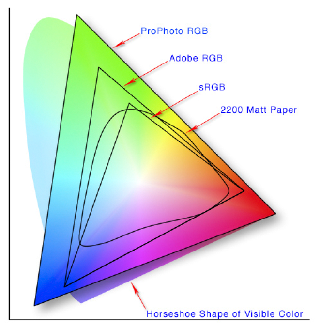
The standard color space has long been sRGB. It’s been around since 1996, and nearly everything uses it because of its simple ubiquity. Until recently, every display targeted compatibility with sRGB, every operating system assumed sRGB, and every photographer knew to make sure their photos were mapped to sRGB. However, sRGB was designed during a time when monitors were simpler and supported a much narrower range of colors. In the past few years, desktop and mobile displays have come on the market that can do so much more, and chances are the phone in your pocket today can show more colors than a monitor from 1996.
Still, not everything is perfect. While modern hardware can show lots of colors, until recently software has lagged behind. Without a single standard like sRGB, the operating system and browser must now be smart enough to know the color space of the display (may or may not be sRGB) plus the color space of the image (may or may not be sRGB), and then map them together on the fly (something called color management). It’s only in the past few years that all of this has come together in a seamless fashion, and the transition has been rough.
Today, there are new color spaces that support more colors on these newer displays. One of the most well supported for photography is called ProPhoto RGB, and it’s the color space I use for all my image editing – but I’ve resisted using it for publishing for a few reasons. First, there are still a handful of older devices with software that can’t understand anything other than sRGB (they’ll show the photos with wildly wrong colors). Second, even though most modern software understands ProPhoto RGB, there are still plenty of displays on the market that don’t support a wider color range (my brand new work laptop can only do sRGB). Finally, I rarely notice enough of a difference to make it worth the hassle. Even though the sRGB versions of my photos do lose a certain something, a lot of details get lost when they’re scaled down for web anyway.
But the Stockholm photo finally changed my mind. My iMac has a nice 5k display with a wide color range, and the sRGB version of my panorama was different enough that it just looked wrong. And if I can see it, then other people using newer displays can too. Here are two versions of the photo comparing sRGB with the more modern ProPhoto RGB color space:
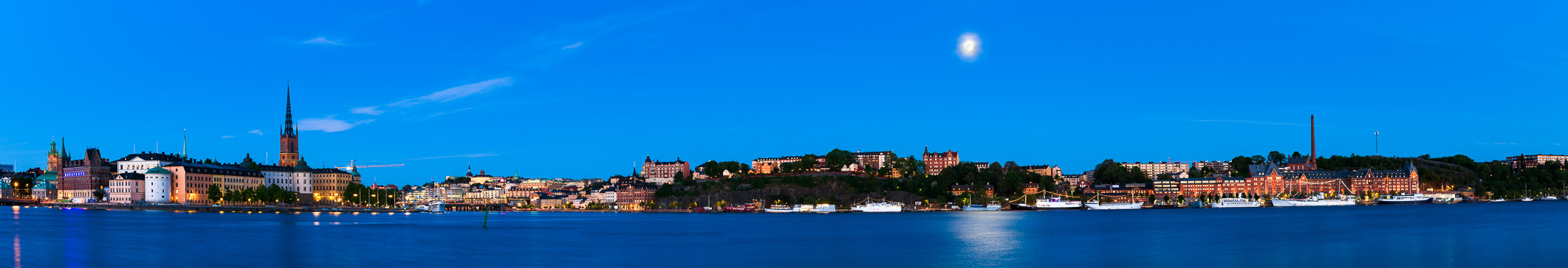
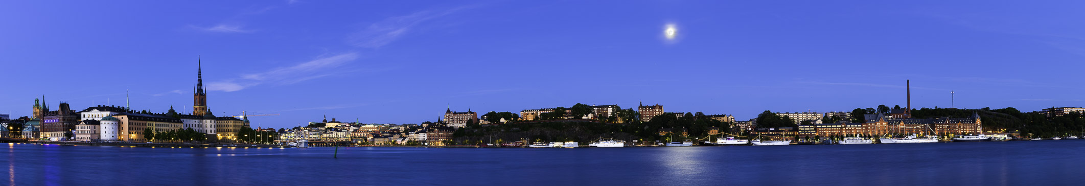
If you can’t see the difference, that’s ok – your display may not support a wide color range. But if you can see the difference, you might see how the blue sky in the sRGB version looks darker and slightly more purple than the sky in the ProPhoto RGB version. You can also see the differences in a closeup of the sky:


In the closeup, you might also see that the building looks more red in the sRGB version and more orange in the ProPhoto RGB version. The sRGB version also lacks color detail. The differences are subtle, but across the whole image it’s profound when seen on the right display.
Going forward, I’m going to start publishing my photos using ProPhoto RGB. Nearly every platform today is color managed, so nearly every platform should be able to properly handle ProPhoto RGB images (the most common exception is older Android devices). If you use a display that supports a wider range of colors, you’ll get to see a bit more color in my photos. And if your display only supports sRGB colors, then you should still see a decent looking photo if your OS and web browser are up-to-date. On the other hand, if you see muted colors or wildly wrong colors, then your browser is probably misinterpreting the ProPhoto RGB color space, and you should consider upgrading your software.
(The color map at the top of this post was created by Cpesacreta at English Wikipedia, licensed under CC BY 2.5.)