Photo Details
| Title: | Upper Antelope Canyon, Page, Arizona |
| Taken: | 19 February, 2011 |
| Location: | |
| Camera: | Canon EOS 5D Mark II |
| Focal length: | 40mm |
| Shutter speed: | 4s |
| Aperture: | ƒ/8 |
| ISO: | 200 |
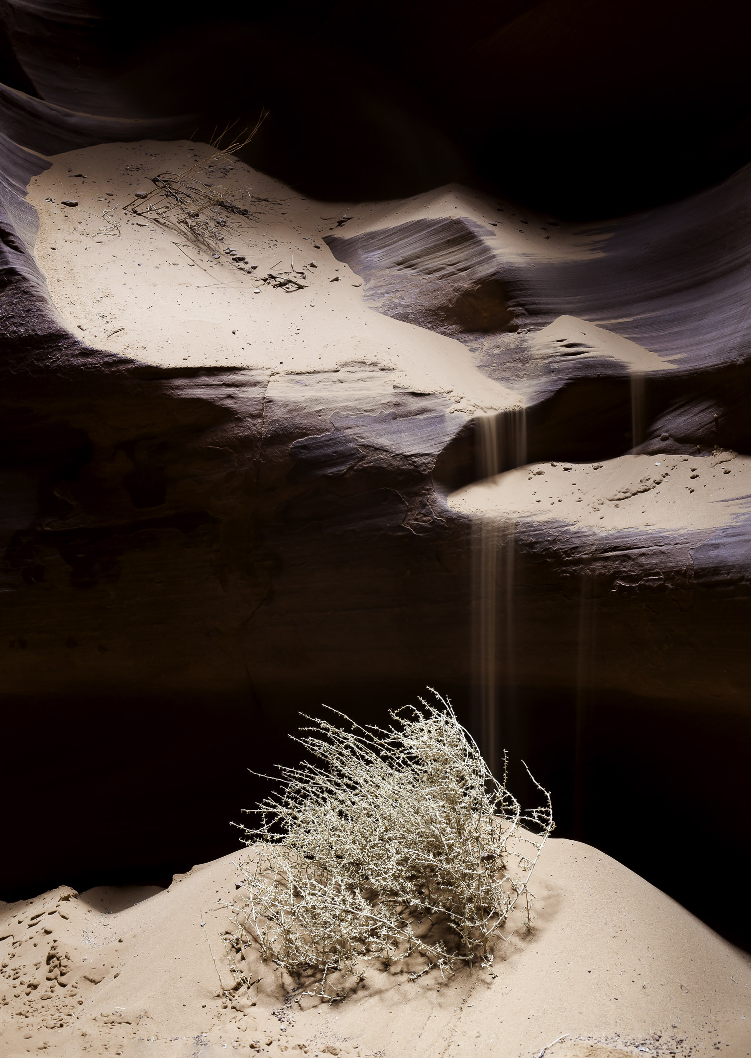
One of the nice things about reposting some of my old photos is that I get to take a second look at them. Most of the time I like them the way they are. They reflect my style at a period in time, and messing with them seems less productive than working on new stuff that reflects my style now. But every once in a while I think “I can improve on this,” and that’s what I’ve done with this photo from Upper Antelope Canyon in Page, Arizona. I originally took this photo on a trip in 2011, and you can see how it looked when I originally published it over on Flickr. However, eight years later, I want to make some tweaks.
The most obvious change is the top cropping. I originally included a lot of negative space at the top, which sort of made sense to me at the time because the photo also has a lot of dark shadowy negative space surrounding the sand and tumbleweed. I recall thinking that including more emptiness at the top added to the mood of the scene, but now I just find it pointless. It takes the eye away from the real subjects of the photo and makes the entire scene look excessively gloomy.

Next, I wanted to lower the bottom crop just a little bit because I felt like the tumbleweed was crowding the bottom of the frame. The original image was tilted (I didn’t have a tripod level back then), so I tilted it back to straight vertical when I posted it in 2011. Unfortunately, fixing the tilt meant I lost some of the bottom room below the tumbleweed, which limited how low the crop could go. The good news is that sand is a very repetitive texture, which makes it a perfect candidate for using Photoshop’s Content Aware Fill to create a little bit more on the bottom of the image. Just a tiny bit of fill allowed me to extend the crop and make the tumbleweed feel less crowded.
Finally, I realized that the photo is so old that it was still using Version 2 of Lightroom’s editing engine. Just switching it to Version 5 made a huge difference in shadow and contrast detail. From there, I further boosted the highlights and contrast – two features that didn’t even exist in Version 2 (well contrast did, but it had a totally different behavior back then). This let me better separate the subjects from the gloom, making the photo less flat and more punchy. Finally, I boosted the clarity slider. I almost never use clarity because I don’t like how it makes my photos look grungy, but in this case it really helped add definition to the stems of the tumbleweed, the sand, and the rocks. It’s a nice improvement, and it just shows how much software changes and improves over time.
I originally took this photo on a trip to Upper Antelope Canyon in February, 2011 when the weather was dreary. There was no sunlight, so we didn’t get any of the incredible light rays you see in many photos from Antelope. Still, the canyon is so gorgeous that I took several wonderful photos on my visit. I recall the guide was the one who suggested throwing sand on the rocks to get the falling effect, which took me a few tries to get right. It worked out nicely in the end.

